HOW TOs
Introduction to EVA Interactions
The Interactive video content types allows you to add interactions on top of video clips. Interactions such as images, elaborating text, links and quizzes pop up while the learner watches the video.

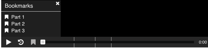
Bookmarks are used to indicate a new topic, an important interaction or an event within the video.
Bookmarks are displayed in the bookmarks menu, which is opened by pressing the Bookmark button next to the Play button:
You add a bookmark by moving the playhead to a desired point in the video and pressing the Bookmark button.
A bookmark will show where each interaction appears in the video.
Move the playhead to 0:00 and press the Bookmark button.
From the menu, press Add bookmark:
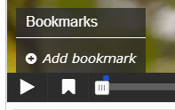
Each bookmark is indicated with a vertical grey line on the seekbar.
Learners can jump directly to a chapter by pressing the bookmarks in the bookmarks menu.
You can edit a bookmark label by moving the playhead so that the bookmark you want to edit is displayed, place the cursor in the bookmark text and edit the text directly.
You delete a bookmark by pressing the button to the right of the bookmark label.
Interactive videos are perfect when you already have a video clip that you want to enrich with added content or interactive elements.
You can facilitate differentiated learning by adding in-depth no-response information such as pictures, tables, text and links that the learner can interact with during video playback.
Choose from EVA’s responsive interactions for the learners to solve at any given time in the video. These require answers to be entered and the data is collected for later use. Answers can be received from named individuals for close assessment of specific users learning, or from unidentified individuals for surveys or more general data gathering.
Interactions can be set to require responses or not and by deciding if viewers can re-try to get the right answers or not you can use an EVA for learning or as an assessment/test.
From the Programme Page click Add to EVA. This will take you to EVA and the My EVA page. Or go to EVA directly, click My EVAs and select Edit or View for the video you have already imported. You can set any start and end point for your EVA to be viewed by entering the times in the Behavioural Settings section below each video being edited.
The toolbar above the video clip displays 17 different options for you to add interactions:

Hover over each Icon and a dialogue box will tell you what that interaction is.
The five Icons on the left are no-response interactions where addition information can be provided on the video.
The twelve remaining Icons are the fully responsive interactions where the response data is collected and saved.
Hover over each Icon and a dialogue box will tell you what that interaction is.
The five Icons on the left are no-response interactions where addition information can be provided on the video.
 |
 |
 |
 |
 |
| Labels | Text | Tables | Links | Images |
 |
 |
 |
 |
 |
 |
 |
 |
 |
 |
 |
| Summary Statements | Single Choice | Multiple Choice | True/False Question | Fill in the Blanks | Drag & Drop | Mark the Words | Drag Text | Crossroads | Navigation Hotspot | Name Input |
Add any interaction by pressing the Icon button on the toolbar, then drag it on top of the video and drop it in the middle of the video. A dialog will appear when you drop the interaction.
Decide how long you want the interaction to be visible. Type in the start time and the end time in the Display time field. If you don't want the video to stop automatically when the interaction appears, leave the Pause checkbox unchecked.
Once you are happy click DONE.
A blue dot will be added to the timeline below the video, to indicate that an interaction is available at this point in the video:

Play the video to make sure the interaction is visible at the correct time.
If you want to make a change, double-press on interaction icons to edit interactive elements.
Decide how long you want the interaction to be visible. Type in the start time and the end time in the Display time field. If you don't want the video to stop automatically when the interaction appears, leave the Pause checkbox unchecked.
Once you are happy click DONE.
A blue dot will be added to the timeline below the video, to indicate that an interaction is available at this point in the video:
Play the video to make sure the interaction is visible at the correct time.
If you want to make a change, double-press on interaction icons to edit interactive elements.
Bookmarks are used to indicate a new topic, an important interaction or an event within the video.
Bookmarks are displayed in the bookmarks menu, which is opened by pressing the Bookmark button next to the Play button:
You add a bookmark by moving the playhead to a desired point in the video and pressing the Bookmark button.
A bookmark will show where each interaction appears in the video.
Move the playhead to 0:00 and press the Bookmark button.
From the menu, press Add bookmark:
Each bookmark is indicated with a vertical grey line on the seekbar.
Learners can jump directly to a chapter by pressing the bookmarks in the bookmarks menu.
You can edit a bookmark label by moving the playhead so that the bookmark you want to edit is displayed, place the cursor in the bookmark text and edit the text directly.
You delete a bookmark by pressing the
button to the right of the bookmark label.
Below the Player is a set of tools that help you control the way in which your EVA will be viewed and options for interactions.
Clip your video.
You can “clip” the video so that viewers are taken the point you want to begin your EVA by entering the time you want to start.
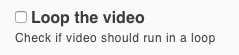
Looping a video is ideal when you want multiple viewers to continue to see the video on one device (or even a touch screen) and be able to see the information or to engage in any interactions that you have added.
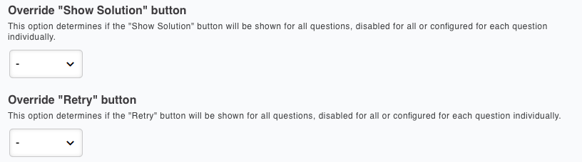
With these two settings you can decide if your EVA is a learning experience where you want viewers to find the correct information, or if it is more like a test.
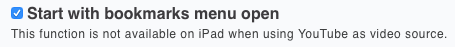
This feature forces the Bookmarks menu to be visible before the video starts playing. The menu will disappear once the video is played and bookmarks accessed as usual.
Please note that YouTube direct linking to EVA is not yet available.

Your viewers can be shown a rewind button to quickly jump back at any time in the video.

This icon then shows in the player control bar.
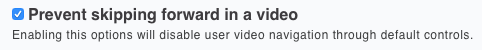
The viewer will not be able to move the cursor to jump to any point in the video. No drag button will be available.

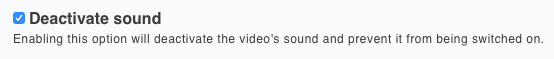
This option can be used when an EVA is being displayed in a public place or when the sound is not wanted as part of your EVA. The audio button will be greyed out and inactive.

Clip your video.
You can “clip” the video so that viewers are taken the point you want to begin your EVA by entering the time you want to start.
Looping a video is ideal when you want multiple viewers to continue to see the video on one device (or even a touch screen) and be able to see the information or to engage in any interactions that you have added.
With these two settings you can decide if your EVA is a learning experience where you want viewers to find the correct information, or if it is more like a test.
This feature forces the Bookmarks menu to be visible before the video starts playing. The menu will disappear once the video is played and bookmarks accessed as usual.
Please note that YouTube direct linking to EVA is not yet available.
Your viewers can be shown a rewind button to quickly jump back at any time in the video.
This icon then shows in the player control bar.
The viewer will not be able to move the cursor to jump to any point in the video. No drag button will be available.
This option can be used when an EVA is being displayed in a public place or when the sound is not wanted as part of your EVA. The audio button will be greyed out and inactive.
EVA allows the learner to get feedback on selected answering options. This might be useful to provide the learner with pointers on what to study more after selecting a certain answering option.
For each option we'll add some feedback to the learner. Use the button to collapse an Option for a better overview when editing.
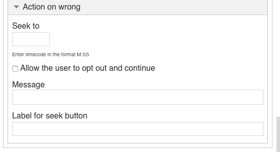
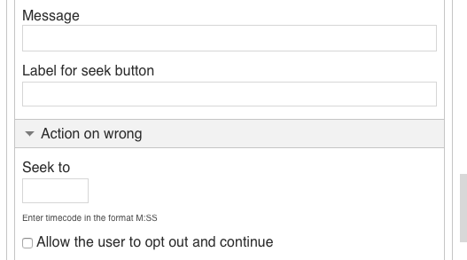
In the Action on all correct option you could type in the text You selected the correct option, well done in the Message field.

In Action on wrong you could type in the text Sorry that is incorrect, try again in the Message field.
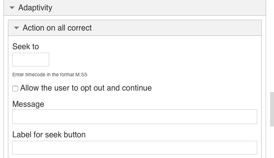
For both correct and wrong answer options, you can have the video jump to another place - forward, if the answer means a student can skip something or backward, so the student can review the video to try to get the correct answer. You can also label the seek button with a message explaining what is happening, such as Let’s look at that again.
For each option we'll add some feedback to the learner. Use the
button to collapse an Option for a better overview when editing.In the Action on all correct option you could type in the text You selected the correct option, well done in the Message field.
In Action on wrong you could type in the text Sorry that is incorrect, try again in the Message field.
For both correct and wrong answer options, you can have the video jump to another place - forward, if the answer means a student can skip something or backward, so the student can review the video to try to get the correct answer. You can also label the seek button with a message explaining what is happening, such as Let’s look at that again.
These settings allow you to change the default display for buttons that the learner sees on the page. These tools are recommended for advanced use only.

This tool enables you to change the default popup names and titles that appear as different buttons are pressed.
You can change the words that appear when results of response questions are displayed.
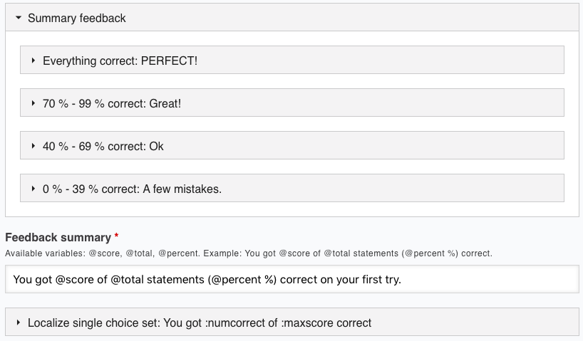
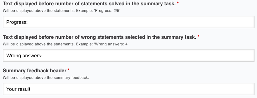
These settings enable you to change the wording that displays for different scores and Summaries.
This tool enables you to change the default popup names and titles that appear as different buttons are pressed.
You can change the words that appear when results of response questions are displayed.
These settings enable you to change the wording that displays for different scores and Summaries.
Click Save to view your finished Interactive video.
Labels, Text, Tables, Links and Images Tutorial
EVA enables you to place information on a video using five available no-response tools.

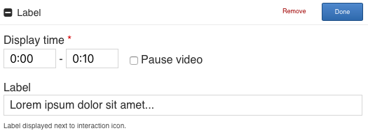
LABEL – Drag the Icon to place a label anywhere on the screen for a chosen duration. The Label is a text that will be displayed next to the interaction icon as a short description of what the learner can expect to find in the interaction.
The editor should now appear. The editor looks like this:
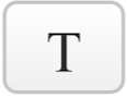
TEXT – Drag the Icon to place any words on the screen as a full poster or as a button that displays the words when the button is clicked.
The editor should now appear. The editor looks like this:
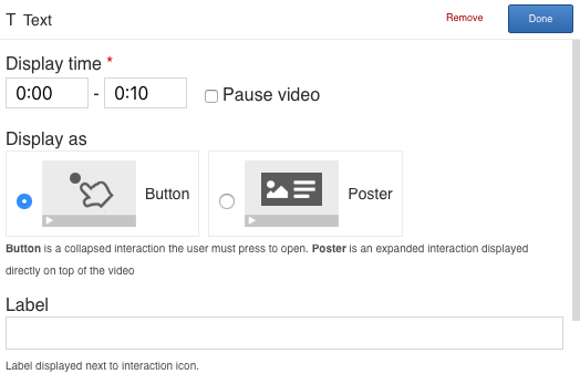

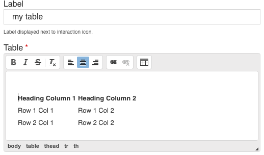
TABLE- Place a Table on the screen as a full poster or as a button that displays the Table when the button is clicked. Choose a duration. Click in the Table area to create a table with as many rows and columns you want. The Table fields can be filled with text and links.
The editor should now appear. The main part of the editor looks like this:

LINKS – Place a link with a name of your choice on the screen. Once entered the link can be moved to any location on the screen. Choose a duration.
The editor should now appear. The editor looks like this:
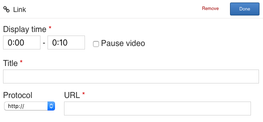

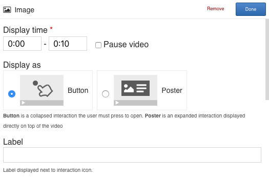
IMAGE –Place images anywhere on the screen, give them a name and display on the screen as a full poster or as a button that displays the Image when the button is clicked.
Press the Image button, drag it onto the video and drop it where you want it to be placed. You can move the interactions around by using drag and drop.
The editor should now appear. The top part of the editor looks like this:
Remember to add appropriate license information when using multimedia you don't own the rights to.
The toolbar above the video clip displays 13 different options for you to add interactions:
The no-response icons are the first five icons on the left.
The no-response icons are the first five icons on the left.
LABEL – Drag the Icon to place a label anywhere on the screen for a chosen duration. The Label is a text that will be displayed next to the interaction icon as a short description of what the learner can expect to find in the interaction.
The editor should now appear. The editor looks like this:
TEXT – Drag the Icon to place any words on the screen as a full poster or as a button that displays the words when the button is clicked.
The editor should now appear. The editor looks like this:
TABLE- Place a Table on the screen as a full poster or as a button that displays the Table when the button is clicked. Choose a duration. Click in the Table area to create a table with as many rows and columns you want. The Table fields can be filled with text and links.
The editor should now appear. The main part of the editor looks like this:
LINKS – Place a link with a name of your choice on the screen. Once entered the link can be moved to any location on the screen. Choose a duration.
The editor should now appear. The editor looks like this:
IMAGE –Place images anywhere on the screen, give them a name and display on the screen as a full poster or as a button that displays the Image when the button is clicked.
Press the Image button, drag it onto the video and drop it where you want it to be placed. You can move the interactions around by using drag and drop.
The editor should now appear. The top part of the editor looks like this:
Remember to add appropriate license information when using multimedia you don't own the rights to.
Save to view your finished EVA.
Statements Tutorial
The Summary content type allows learners to interactively build a summary of a certain topic. Summaries are a perfect way to strengthen your learners’ ability to remember by encouraging them to build interactive summaries as they learn.
Here's the Summary we'll create in this tutorial:
Summaries work best when they are presented to the learner immediately after the learning content.
Examples are:
Click on the Summary Statements Icon

The Summary editor should now appear. The top part of the editor looks like this:
In this tutorial, we will focus on creating the actual Summary content, which happens in the top part of the Summary editor. The lower part of the editor, below the label Common fields, deals with translations and default text and is not important in this context.
Examples are:
- at the end of an article or a chapter of text
- at the end of a video
- at the last slide of a presentation
Click on the Summary Statements Icon
The Summary editor should now appear. The top part of the editor looks like this:
In this tutorial, we will focus on creating the actual Summary content, which happens in the top part of the Summary editor. The lower part of the editor, below the label Common fields, deals with translations and default text and is not important in this context.
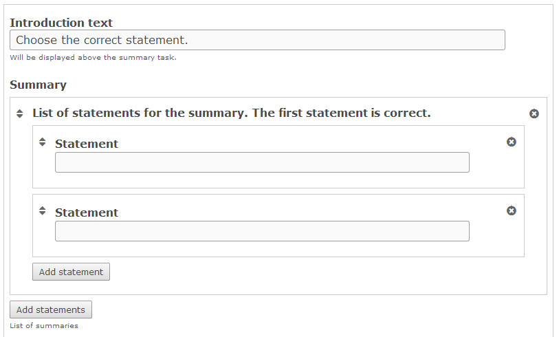
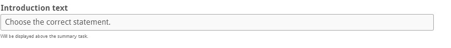
The Introduction text will be visible to the learner throughout the Summary. You can use this field to give the learner a short introduction or some instructions. A default Introduction text which works fine in most cases, is suggested. However, you may modify or translate it into another language.
The Summary content type consists of a sequence of statement groups.
By default, the first statement group consists of two blank text fields each labeled Statement.
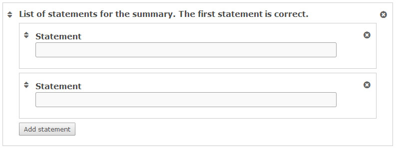
You need one correct statement and at least one incorrect statement in each statement group for the Summary to make any sense.
Note that the top statement in any statement group should always be the correct one.
In the top Statement field, add the text:
Blueberries are edible, round berries. This will be the correct statement.
In the bottom Statement field, add the text:
Blueberries are non-edible, elongated berries. This is, of course, an incorrect statement.
You can add as many incorrect statements as you want. Add another statement by pressing the Add statement button. In the third Statement field that now has appeared, add the text:
Blueberries are non-edible, round berries.
You should now have something like this:
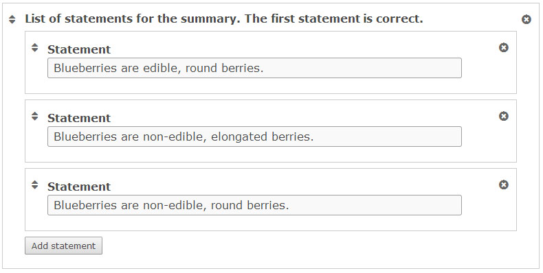
We have now finished our first statement group! However, only one statement group makes a very short summary of the topic. You would usually like to add two or more statement groups.
By default, the first statement group consists of two blank text fields each labeled Statement.
You need one correct statement and at least one incorrect statement in each statement group for the Summary to make any sense.
Note that the top statement in any statement group should always be the correct one.
In the top Statement field, add the text:
Blueberries are edible, round berries. This will be the correct statement.
In the bottom Statement field, add the text:
Blueberries are non-edible, elongated berries. This is, of course, an incorrect statement.
You can add as many incorrect statements as you want. Add another statement by pressing the Add statement button. In the third Statement field that now has appeared, add the text:
Blueberries are non-edible, round berries.
You should now have something like this:
We have now finished our first statement group! However, only one statement group makes a very short summary of the topic. You would usually like to add two or more statement groups.
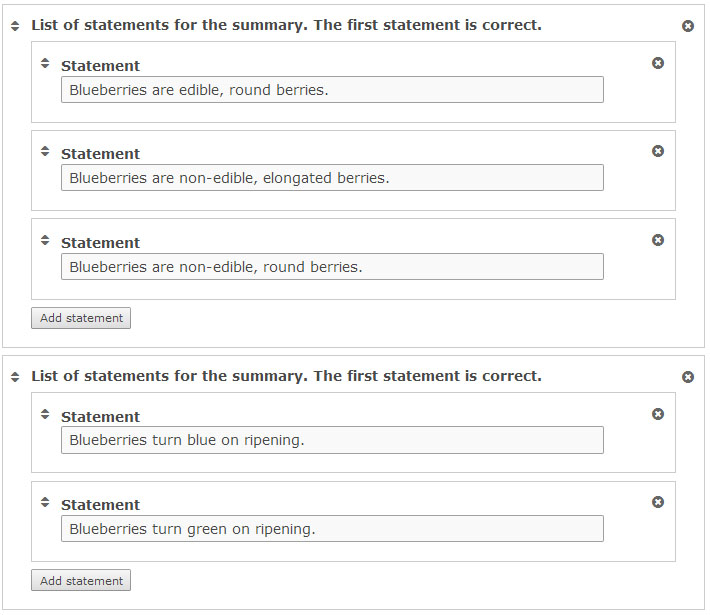
Press the button Add statements. This will add a second group of statements.
In the top statement field, add the text:
Blueberries turn green on ripening. As the blueberry experts we are, we know this is a wrong statement.
In the bottom statement field, add the text:
Blueberries turn blue on ripening. This is the correct statement.
As the top statement should be the correct one, we will have to change the order of the statements. You change the order by pressing the button in the top left corner of the statement group, drag it to the top of the List of statements, and drop it there. Now the correct statement is at the top of statement group, as it should be.
You should now have something like this:
You can also change the order of entire statement groups in the same way. Just use the button in the top left corner of the statement group instead.
Repeat step 6 until you have added enough correct statements to summarize the topic well.
You delete statements or statement groups by using the button in the top right corner.
In the top statement field, add the text:
Blueberries turn green on ripening. As the blueberry experts we are, we know this is a wrong statement.
In the bottom statement field, add the text:
Blueberries turn blue on ripening. This is the correct statement.
As the top statement should be the correct one, we will have to change the order of the statements. You change the order by pressing the
button in the top left corner of the statement group, drag it to the top of the List of statements, and drop it there. Now the correct statement is at the top of statement group, as it should be.You should now have something like this:
You can also change the order of entire statement groups in the same way. Just use the
button in the top left corner of the statement group instead.Repeat step 6 until you have added enough correct statements to summarize the topic well.
You delete statements or statement groups by using the button in the
top right corner.
Press Save when you are done!
Single Choice Set Tutorial
The Single Choice Set content type allows allows content designers to create question sets with one correct answer per question. The end user gets immediate feedback after submitting each answer.
Single Choice Set questions can be used for testing skills related to any topic, and can be an effective assessment tool. With immediate feedback and a summary at the end, user learning is reinforced. Single Choice Set features sound effects for correct and wrong (sound effects may be turned off).
Click on the Single Choice Question icon.

The Single Choice question editor should now appear. The editor should look something like this:
The content creation happens in the top part of the editor, so we'll only focus on this for now.
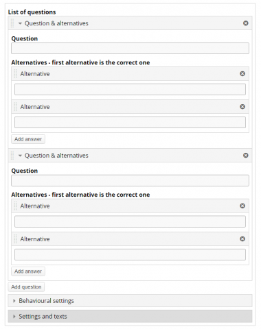
The Single Choice Set question content type consists of a question and a set of alternatives. The Question is used to introduce the problem to be solved, and the alternatives are the possible answers the learner can choose from.
Click on the Single Choice Question icon.
The Single Choice question editor should now appear. The editor should look something like this:
The content creation happens in the top part of the editor, so we'll only focus on this for now.
The Single Choice Set question content type consists of a question and a set of alternatives. The Question is used to introduce the problem to be solved, and the alternatives are the possible answers the learner can choose from.
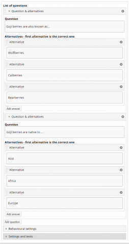
Write the first question under Question and enter the three alternatives under ‘Alternatives’. In order to create additional alternatives press the ‘Add answer’ button. The first (top) answering alternative is always the correct one. But don't worry, the answering alternatives will be randomized in the end user view. Also remember that you can only have one correct answering alternative for each question.
Fill in the rest of the alternatives.
The Single Choice Editor should now look like this:
Fill in the rest of the alternatives.
The Single Choice Editor should now look like this:
You can add additional questions by clicking the ‘Add question’ button. Click 'add question' and fill in the newly added question with alternatives.
Fill in your third question so that your editor looks somewhat like this:
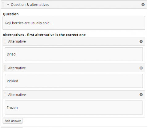
Fill in your third question so that your editor looks somewhat like this:
You may change the order of questions by pressing the  button in the top left corner of the Question & Alternatives, drag and drop within the List of questions.
You can also change the order of the alternatives in the same way. Just use the button in the top left corner of the alternative. Just remember the top alternative is the correct one. You can delete the question & alternatives or alternative by using the  button in the top right corner.
You will have something like this when you swap the second and third alternatives of the third question:
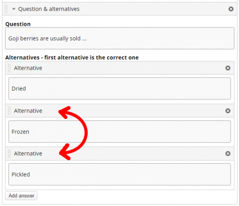
button in the top left corner of the Question & Alternatives, drag and drop within the List of questions.You can also change the order of the alternatives in the same way. Just use the
button in the top left corner of the alternative. Just remember the top alternative is the correct one. You can delete the question & alternatives or alternative by using the button in the top right corner.You will have something like this when you swap the second and third alternatives of the third question:
Press Save when you are done!
Multiple Choice Question Tutorial
The Multiple Choice content type is your staple multiple choice quizzing tool. Multiple Choice can be used to test the learner's level of knowledge on a given topic.
Multiple Choice questions:

The Multiple Choice question editor should now appear. The editor should look something like this:
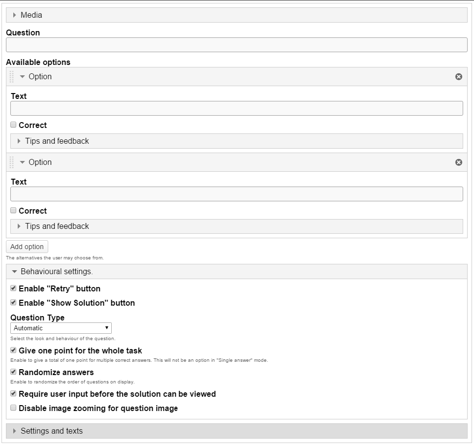
The Multiple Choice question content type consists of a question and a set of options.
The Question is used to introduce the problem to be solved, and the Options are the possible answers the learner can choose from.
- can be used for testing well-defined skills related to a certain topic.
- can be an effective assessment tool when they are created properly and the learner is given immediate feedback on own performance.
- can have a single or multiple correct options per question.
The Multiple Choice question editor should now appear. The editor should look something like this:
The Multiple Choice question content type consists of a question and a set of options.
The Question is used to introduce the problem to be solved, and the Options are the possible answers the learner can choose from.
We'll add a simple Question related to the example text about Blackcurrants for the learner to solve.
Type the following text in the field labeled Question in the top of the editor: What color does the blackcurrant berry actually have?
Your editor should now look similar to this:
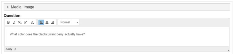
Type the following text in the field labeled Question in the top of the editor: What color does the blackcurrant berry actually have?
Your editor should now look similar to this:
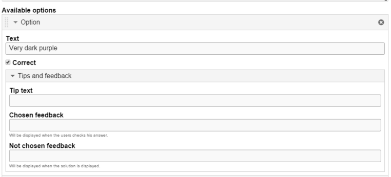
Under Available options, we add the answering options the learner can choose from.
Two empty available options are listed by default, since we usually need at least one correct and one incorrect answering option.
In this tutorial, we'll use three answering options related to the question about what color the blackcurrant berry actually has:
You should now have something like this:
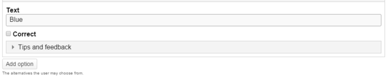
Move on to the second and bottom Option, and type in Blue in the text field labeled Text.
Leave the Correct checkbox unchecked as this an incorrect answering option.
We want to add a third answering option. Currently we only have two available options, so we'll have to add another one by pressing the Add option button below the two currently available options:
Another Option will be added after you press Add option. In the third and now bottom Option, type in Black in the text field labeled Text.
Leave the Correct checkbox unchecked as this a second incorrect answering option.
We are now done with adding answering options.
You can add as many answering options as you want. You remove answering options by pressing the button in the top right corner of the Option. You change the order of the answering options by pulling the
  button in the top left corner of the Option.
Two empty available options are listed by default, since we usually need at least one correct and one incorrect answering option.
In this tutorial, we'll use three answering options related to the question about what color the blackcurrant berry actually has:
- Very dark purple
- Dark blue
- Black
You should now have something like this:
Move on to the second and bottom Option, and type in Blue in the text field labeled Text.
Leave the Correct checkbox unchecked as this an incorrect answering option.
We want to add a third answering option. Currently we only have two available options, so we'll have to add another one by pressing the Add option button below the two currently available options:
Another Option will be added after you press Add option. In the third and now bottom Option, type in Black in the text field labeled Text.
Leave the Correct checkbox unchecked as this a second incorrect answering option.
We are now done with adding answering options.
You can add as many answering options as you want. You remove answering options by pressing the
button in the top right corner of the Option. You change the order of the answering options by pulling the button in the top left corner of the Option.
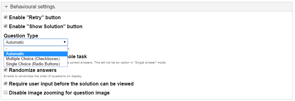
User can select one of the following question type in Multiple Choice present under Behavioral Settings
You will have something like this in the editor:
In this case we only want to use a single correct answer, so we'll keep the default question type as 'Automatic' from the drop down present under Behavior Settings.
Check the Randomize answers checkbox to make the answering options display in an arbitrary order.
Your editor should now look similar to this:
Next you will find the “Check” WHAT DOES CHECK DO? or “Retry” button options. Leave Retry checked, if you want the learner to be able to try to solve the Multiple Choice questions multiple times.
- Automatic
- Multiple Choice (Checkboxes)
- Single Choice (Radio Buttons)
Automatic:
By default, question type 'Automatic' is selected. If you have multiple correct options, then it will behave like Multiple choice and checkboxes will be displayed automatically. If you have one correct option, then it will behave like Single Choice and radio buttons will be displayed automatically.Multiple Choice:
You can select the question type 'Multiple Choice' from the drop down if you have multiple correct options and checkboxes will be displayedSingle Choice:
You can select the question type 'Single Choice' from the drop down, if you have single correct option and radio buttons will be displayed.You will have something like this in the editor:
In this case we only want to use a single correct answer, so we'll keep the default question type as 'Automatic' from the drop down present under Behavior Settings.
Check the Randomize answers checkbox to make the answering options display in an arbitrary order.
Your editor should now look similar to this:
Next you will find the “Check” WHAT DOES CHECK DO? or “Retry” button options. Leave Retry checked, if you want the learner to be able to try to solve the Multiple Choice questions multiple times.
Multiple Choice allows the learner to get feedback on selected answering options. This might be useful to provide the learner with pointers on what to study more after selecting a certain answering option.
For each option we'll add some feedback to the learner. Use the button to collapse an Option for a better overview when editing.

In the Action on all correct option you could type in the text You selected the correct option, well done in the Message field.
In Action on wrong you could type in the text Sorry that is incorrect, try again in the Message field.
For both correct and wrong answer options, you can have the video jump to another place - forward, if the answer means a student can skip something or backward, so the student can review the video to try to get the correct answer. You can also label the seek button with a message explaining what is happening, such as Let’s look at that again.
For each option we'll add some feedback to the learner. Use the
button to collapse an Option for a better overview when editing.In the Action on all correct option you could type in the text You selected the correct option, well done in the Message field.
In Action on wrong you could type in the text Sorry that is incorrect, try again in the Message field.
For both correct and wrong answer options, you can have the video jump to another place - forward, if the answer means a student can skip something or backward, so the student can review the video to try to get the correct answer. You can also label the seek button with a message explaining what is happening, such as Let’s look at that again.
Save to view your finished Multiple Choice question.
True/False Question
True/False Question is a simple and straightforward content type that can work by itself or combined into other content types such as Course Presentation.
A more complex question can be created by adding an image or a video.
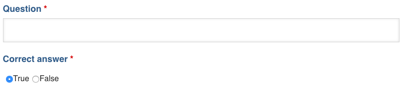
Enter the question, click True or False.
To finish click DONE. Then Click SAVE.
Only one question can be added at a time. To add another True/False question, just repeat this process.
Fill in the Blanks Tutorial
The Fill in the blanks allows e-learning designers to create cloze tests. Portions of words or sentences are removed from a text and the learner is asked to replace the missing text.
Fill in the Blanks can be used effectively in language learning. A Fill in the Blanks test assesses the learner's ability to understand context, vocabulary or grammatical concepts in order to correctly replace the missing pieces of text.
In addition to native and second language learning, Fill in the Blanks can be used to test the learner's ability to reproduce facts or mathematical inferences.
Click on the Fill in the Blanks icon.

The Fill in the blanks question editor should now appear. The top part of the editor looks like this:
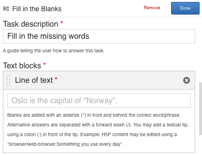
The Fill in the blanks editor consists of Task description and Text blocks.
In addition to native and second language learning, Fill in the Blanks can be used to test the learner's ability to reproduce facts or mathematical inferences.
Click on the Fill in the Blanks icon.
The Fill in the blanks question editor should now appear. The top part of the editor looks like this:
The Fill in the blanks editor consists of Task description and Text blocks.
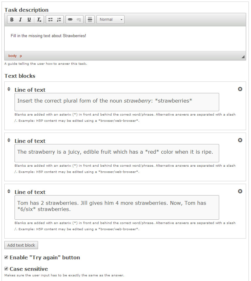
In the Task description field we give the learner basic instructions or introduce the problem to be solved.
We'll use this text for the Task description: Insert the missing words or expressions.
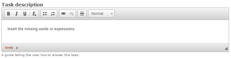
We'll use this text for the Task description: Insert the missing words or expressions.
Under Text blocks we add our three sentences and define which words are to be remove for the learner to identify.
We can add multiple text blocks, and we can remove multiple words in each text block.
By default, only a single Text block is displayed when you create a new Fill in the blanks.
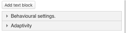
Because we have three sentences, we would like to add two more Text blocks. Press the Add text block button twice to add two more Text blocks.
In the top Text block, we add the following sentence under Line of text:
Insert the correct plural form of the noun strawberry: strawberries
We insert asterisks before and after the word we would like to remove, like this:
Insert the correct plural form of the noun strawberry:
*strawberries*
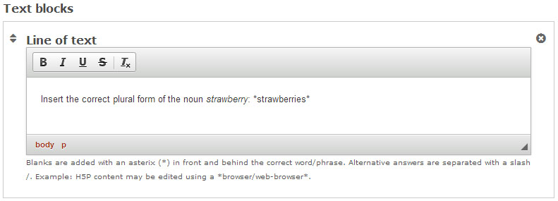
In the screenshot above, we have used the text formatting toolbar to highlight strawberry in italics.
Add the following text in the second Text block, under Line of text:
The strawberry is a juicy, edible fruit which has a *red* color when it is ripe.
In the third and bottom Text block, we add the following text under Line of text:
Tom has 2 strawberries. Jill gives him 4 more strawberries. Now, Tom has *6* strawberries.
In this last sentence, we want to allow the learner to insert both the number 6 as well as the word six.
We can define alternative answers by using a slash to separate the accepted alternative answers inside the asterisks, like this:
Tom has 2 strawberries. Jill gives him 4 more strawberries. Now, Tom has *6/six* strawberries.
You should now have something like this:
You can add as many Text blocks as you want. You remove Text blocks by pressing the button in the top right corner of the Text block. You change the order of the Text blocks by pulling the
  button in the top left corner of the Text block.
We can add multiple text blocks, and we can remove multiple words in each text block.
By default, only a single Text block is displayed when you create a new Fill in the blanks.
Because we have three sentences, we would like to add two more Text blocks. Press the Add text block button twice to add two more Text blocks.
In the top Text block, we add the following sentence under Line of text:
Insert the correct plural form of the noun strawberry: strawberries
We insert asterisks before and after the word we would like to remove, like this:
Insert the correct plural form of the noun strawberry:
*strawberries*
In the screenshot above, we have used the text formatting toolbar to highlight strawberry in italics.
Add the following text in the second Text block, under Line of text:
The strawberry is a juicy, edible fruit which has a *red* color when it is ripe.
In the third and bottom Text block, we add the following text under Line of text:
Tom has 2 strawberries. Jill gives him 4 more strawberries. Now, Tom has *6* strawberries.
In this last sentence, we want to allow the learner to insert both the number 6 as well as the word six.
We can define alternative answers by using a slash to separate the accepted alternative answers inside the asterisks, like this:
Tom has 2 strawberries. Jill gives him 4 more strawberries. Now, Tom has *6/six* strawberries.
You should now have something like this:
You can add as many Text blocks as you want. You remove Text blocks by pressing the
button in the top right corner of the Text block. You change the order of the Text blocks by pulling the button in the top left corner of the Text block.
Check the Enable "Retry" button checkbox to allow the learner to try to solve the Fill in the blanks multiple times.
You might want to consider whether you want the user to only get one chance to solve the task.
If you are not concerned whether the learner uses capital letters or not when inserting the missing text, uncheck the Case sensitive checkbox. Example: The learner will get a correct answer when inserting both Strawberries and strawberries in the first sentence.
Save to view your finished Fill in the Blanks.
Drag and Drop Tutorial
The Drag and drop content type allows learners to drag a piece of text or an image and drop it on one or more corresponding dropzones.
Drag and Drop enables the learner to associate two or more elements and to make logical connections in a visual way. Here are some examples:
Click on the Drag and Drop icon.
The Drag and Drop question editor should now appear.
The main part of the editor looks like this:
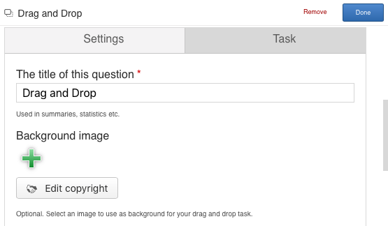
We'll focus on creating the Drag and Drop question content in this tutorial. The content creation happens in the top part of the editor, so we'll focus on this part here.
There are two steps in creating a Drag and Drop question: Settings and Task. You can press the Settings and Task tabs at the top of the editor at any time to navigate between the views.
- Group elements that belong together or have something in common
- Match an object with another object
- Put elements in the correct order
- Place elements at a correct position
Click on the Drag and Drop icon.
The Drag and Drop question editor should now appear.
The main part of the editor looks like this:
We'll focus on creating the Drag and Drop question content in this tutorial. The content creation happens in the top part of the editor, so we'll focus on this part here.
There are two steps in creating a Drag and Drop question: Settings and Task. You can press the Settings and Task tabs at the top of the editor at any time to navigate between the views.
Settings deals with general settings such as background image and size.
We'll add this background image:

Press the green icon to add a background image. Browse to where you downloaded the strawberry image above and select it.
You can add license information for the background image by pressing the Edit copyright button:
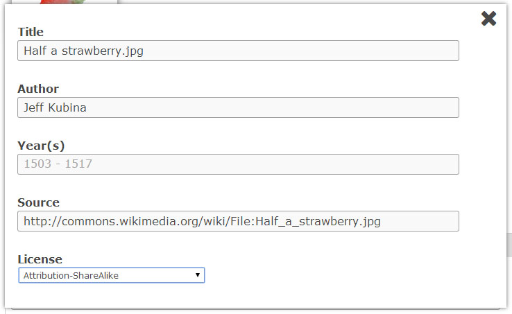
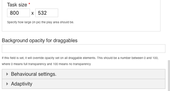
Now that we've added a background image, you can define the size of the Drag and Drop question. Since the image has a width of 800 px and a height of 532 px, use this size for the task.
The Drag and Drop question will be scaled to the maximum width of the page where it is placed, after saving. The Size defines the width and height of the editor as well as the aspect ratio of the Drag and Drop question, rather than the actual size in pixels when it is viewed.
We'll add this background image:
Press the green
icon to add a background image. Browse to where you downloaded the strawberry image above and select it.You can add license information for the background image by pressing the Edit copyright button:
Now that we've added a background image, you can define the size of the Drag and Drop question. Since the image has a width of 800 px and a height of 532 px, use this size for the task.
The Drag and Drop question will be scaled to the maximum width of the page where it is placed, after saving. The Size defines the width and height of the editor as well as the aspect ratio of the Drag and Drop question, rather than the actual size in pixels when it is viewed.
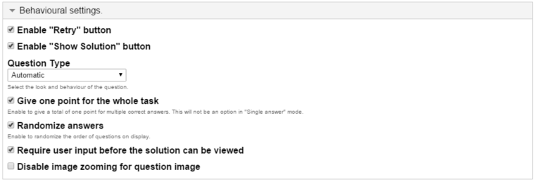
If you want learners to be able to try to solve the Drag and Drop question multiple times, as opposed to only have one go, check the Enable Retry button option.
The Give one point for the whole task controls the score the learner gets for solving the Drag and Drop question when it is placed in a sequence of multiple tasks. If you are creating a stand-alone Drag and drop question, it doesn't matter whether we'll leave this option checked of not.
The Give one point for the whole task controls the score the learner gets for solving the Drag and Drop question when it is placed in a sequence of multiple tasks. If you are creating a stand-alone Drag and drop question, it doesn't matter whether we'll leave this option checked of not.
Press the Task tab in the top right half of the editor to start creating the task itself.
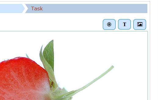
You'll see that the background image is displayed with the size defined in the Settings tab.
We'll create a Drag and drop question where the user tries to associate the strawberry with its corresponding genus name. According to Wikipedia, a genus is a taxonomic rank used in the biological classification of living and fossil organisms. From the example text above, we know that the strawberry belongs to the Fragaria genus. Other examples of berry genuses are Rubus (e.g. Raspberries) and Vaccinnium (e.g. Blueberries). We'll use these last two examples as false alternatives. You will see a toolbar above the background image.
The toolbar allows you to insert:
Dropzones , Texts
  and Images
  .
.
Dropzones are areas on which Text and Image draggable elements can be dropped.
You'll see that the background image is displayed with the size defined in the Settings tab.
We'll create a Drag and drop question where the user tries to associate the strawberry with its corresponding genus name. According to Wikipedia, a genus is a taxonomic rank used in the biological classification of living and fossil organisms. From the example text above, we know that the strawberry belongs to the Fragaria genus. Other examples of berry genuses are Rubus (e.g. Raspberries) and Vaccinnium (e.g. Blueberries). We'll use these last two examples as false alternatives. You will see a toolbar above the background image.
The toolbar allows you to insert:
Dropzones
, Texts and Images .Dropzones are areas on which Text and Image draggable elements can be dropped.
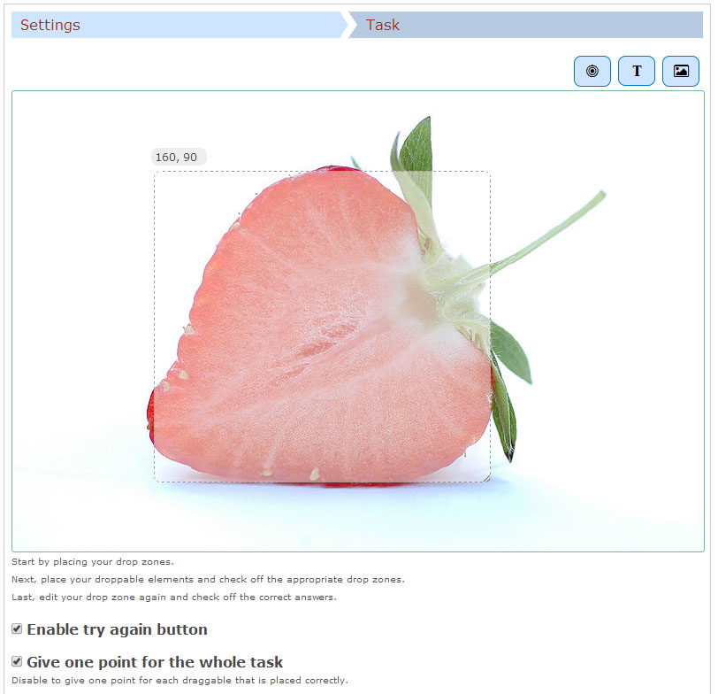
We start off by adding a Dropzone over the strawberry shown in the background image. Press the Dropzone button in the toolbar, drag it onto the background image and drop it somewhere above the strawberry.
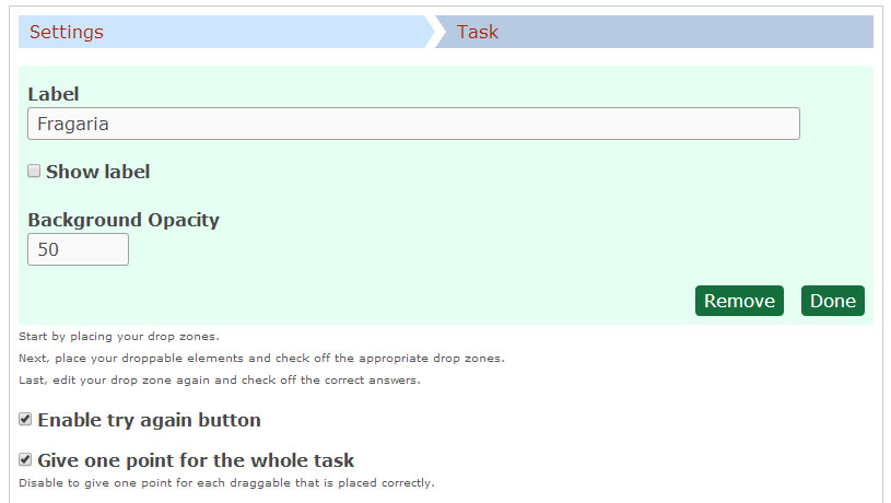
Dropzone options appear when you drop it. We add the Label Fragaria, which is the name of the genus the Strawberry belongs to. Set the opacity to 50 to make it semi-transparent.
You will have something like this:
Press Done.
You will now see a white dropzone placed over the background image. Move and resize the dropzone so that it is placed roughly over the Strawberry in the backgound image. You move the dropzone by pressing and dragging it to where you want it placed. You resize the dropzone by pressing the the lower right corner of the dropzone and dragging up/down or left/right to scale the dropzone to the right proportions.
Double-press the dropzone to edit it at any time.
You should now have something like this:
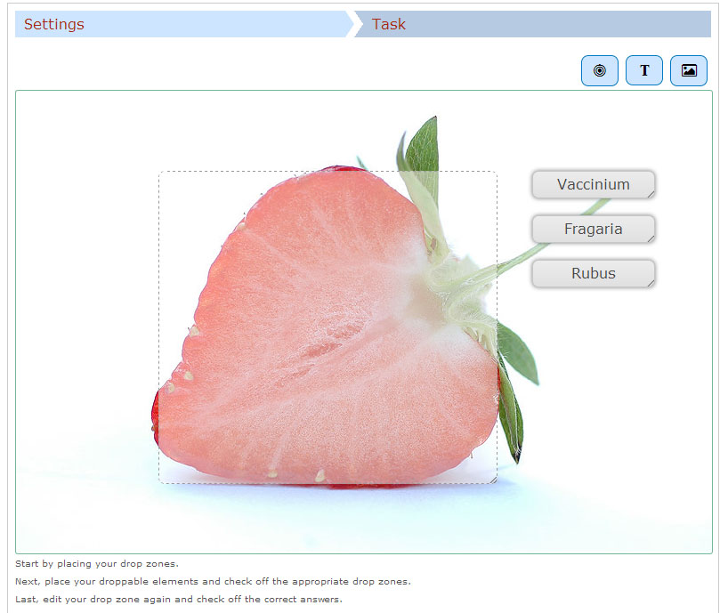
In this tutorial we'll add three Text draggable elements; one correct and two incorrect. Images can be used as draggable elements in the same way as Text.
Press the Text button in the toolbar and drag it onto the background image. You can place it to the right of the strawberry. Text options appear when you drop it.
In the Label field, type in Vaccinium. Under Select drop zones, check the Fragaria checkbox. We know this is an incorrect match, however, we want the learner to be able to drop the Vaccinium object on the Fragaria dropzone. If this option was unchecked, the learner would not have been allowed to drop the object on the dropzone. This is more relevant in cases where you have more than one dropzone.
Leave the opacity to 100 and press Done. You will now see the Vaccinium draggable object where you placed it.
Move and resize the draggable object as you please. You move it around by pressing on it and then drag it to where you want it. You reize by pressing in the lower right corner of the object and then pull in any direction to scale.
Add two more Text draggable elements by following the exact same procedure as above. However, label these elements Fragaria and Rubus respectively. Place them in a neat alignment to the right of the Strawberry.
Double-press the draggable object to edit it at any time.
Hopefully, you will now have something like this:
In order to define which match between dropzone and draggable elements is correct, you double-press on the dropzone. This will bring up the same dropzone options as in the Task step.
Since you have defined an association between the three draggable elements and the Fragaria dropzone in the previous step, you will now see a Select correct elements option. Check the Text: Fragaria checkbox to define this draggable object as the correct match.
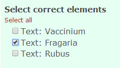
Now, set the opacity to 0 (zero) and press Done.
Multiple correct elements can be placed on a dropzone.
Since you have defined an association between the three draggable elements and the Fragaria dropzone in the previous step, you will now see a Select correct elements option. Check the Text: Fragaria checkbox to define this draggable object as the correct match.
Now, set the opacity to 0 (zero) and press Done.
Multiple correct elements can be placed on a dropzone.
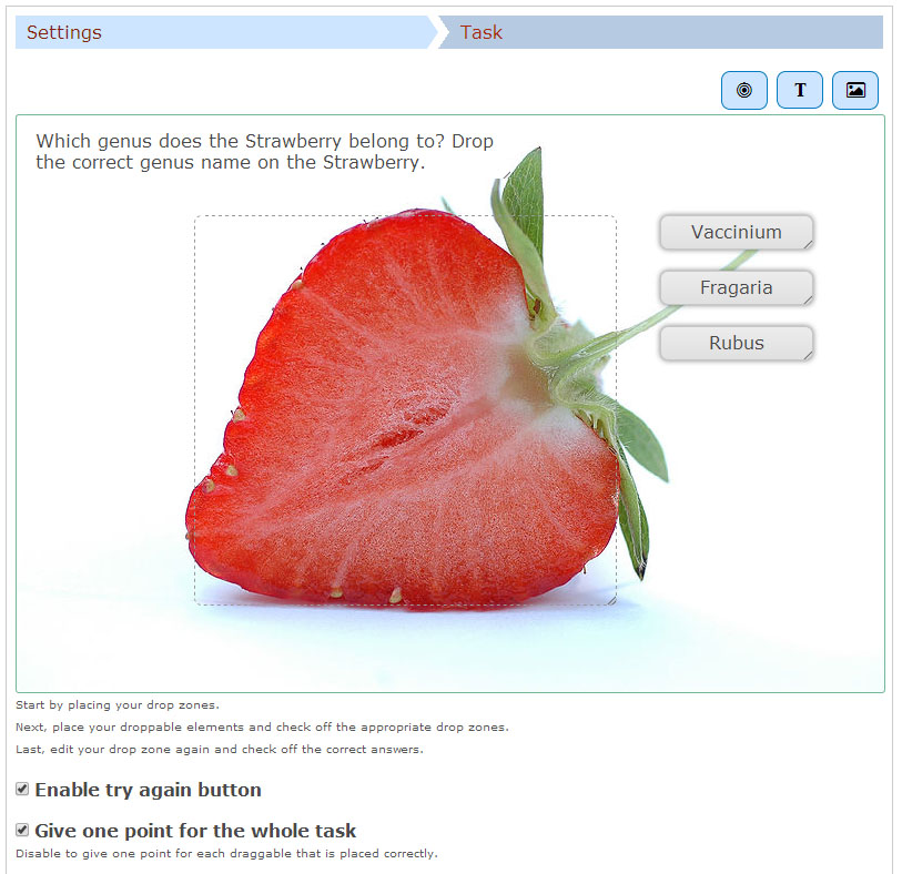
We are now more or less finished. We might want to add an instructional text such as: Which genus does the Strawberry belong to? Drop the correct genus name on the Strawberry.
This is done by adding a Text element, and type in our instructions in the Label field.
As instructional text should not be a draggable element, we do not select a corresponding dropzone.
Place the instructional text in the top right corner and resize it as you please.
You should now have something like this:
Save to view your finished Drag and Drop question.
Mark the Words Tutorial
The Mark the Words content type allows learners to identify a word in a sentence or phrase according to a set question
Mark the Words allows the learner to identify a word as belonging to a particular group or category in response to a question. In the context of a video this tool is ideal to check understanding of word types or associations.
Click on the Mark the Words icon.
The Mark the Words question editor should now appear.
The main part of the editor looks like this:
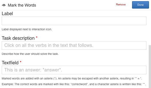
Simply select the words you want the learner to identify by placing an asterix * before the first and after the last letter of the word.
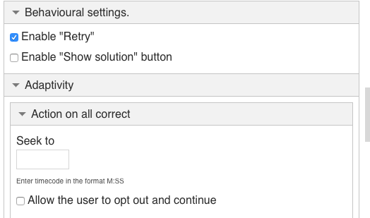
Behavioural settings allow you to enable a retry and for the correct answer to be displayed if the answer is incorrect.
The Adaptivity settings provide options for different things to happen with the video jumping ahead with a correct answer or jumping back to have the learner review the video to get the answer correct.


Click on the Mark the Words icon.
The Mark the Words question editor should now appear.
The main part of the editor looks like this:
Simply select the words you want the learner to identify by placing an asterix * before the first and after the last letter of the word.
Behavioural settings allow you to enable a retry and for the correct answer to be displayed if the answer is incorrect.
The Adaptivity settings provide options for different things to happen with the video jumping ahead with a correct answer or jumping back to have the learner review the video to get the answer correct.
Save to view your finished Mark the Words EVA.
Drag Text Tutorial
The Drag Text content type allows learners to identify which of a set of words choice are correctly placed into a set of related sentences.
Drag Text is a form of a multiple choice question that allows the learner to identify which words belonging to which sentence in response to a question. The learner is given several words to choose from and must decise which word to place into one of several sentences. In the context of a video this tool is ideal to check understanding of recently provided information.
Click on the Drag Text icon.
The Drag Text question editor should now appear.
The main part of the editor looks like this:
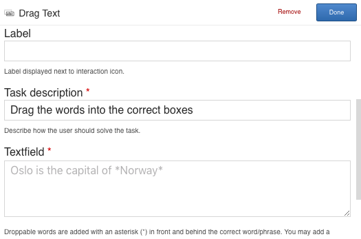
Select the word you want the learner to identify by placing an asterix * before the first and after the last letter of the word.
Ideally should create multiple sentences and word answers. The question sentences will appear in the order written but the word answers will be randomized. The learner drags their word choice onto the space provided in the sentence of their choice.
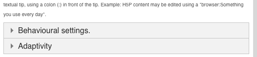
You can give the learner a clue using a “tip” by placing a colon : before the “tip” immediately following the word. Remember to then place the second asterix after the “tip”.
Behavioural settings allow you to enable a retry and for the correct answer to be displayed if the answer is incorrect.
The Adaptivity settings provide options for different things to happen with the video jumping ahead with a correct answer or jumping back to have the learner review the video to get the answer correct.
Click on the Drag Text icon.
The Drag Text question editor should now appear.
The main part of the editor looks like this:
Select the word you want the learner to identify by placing an asterix * before the first and after the last letter of the word.
Ideally should create multiple sentences and word answers. The question sentences will appear in the order written but the word answers will be randomized. The learner drags their word choice onto the space provided in the sentence of their choice.
You can give the learner a clue using a “tip” by placing a colon : before the “tip” immediately following the word. Remember to then place the second asterix after the “tip”.
Behavioural settings allow you to enable a retry and for the correct answer to be displayed if the answer is incorrect.
The Adaptivity settings provide options for different things to happen with the video jumping ahead with a correct answer or jumping back to have the learner review the video to get the answer correct.
Save to view your finished Drag Text EVA.
Crossroads Tutorial
The Crossroads content type allows viewers to be taken to chosen time in the video based on their answer to a question.
Crossroads is a way to take a viewer to another place in the video based on which of a set of questions they select.
This tool can be used simply as a chapter listing for parts of a video.
Or, if questions are being asked, and a learner has answered correctly they could be taken ahead in the video to a new set of content. If they answer wrongly or are uncertain, they could be taken back to view a relevant part of the video again.
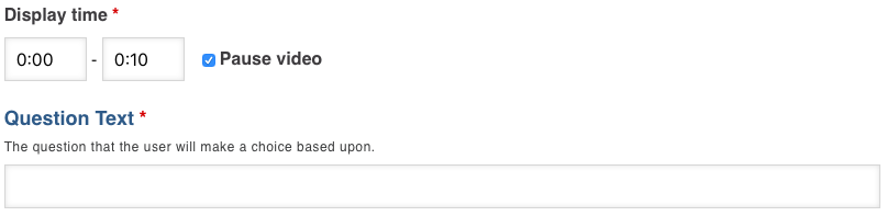
Select your display time start and end and choose to pause the video or not. Enter the text about the Question or Choice the viewer is being asked to make.
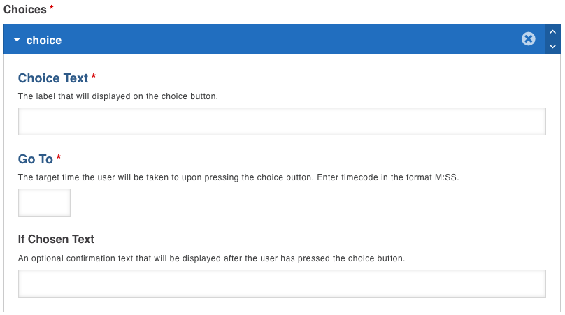
Enter as many options as you want the learner to choose from and the time in the video that you want them to be taken to if the learner chooses that option. You can create a popup comment to explain to the user what their choice means and what is therefore happening with the video they are watching. Continue to add as many Crossroad choices as you want.
Select your display time start and end and choose to pause the video or not. Enter the text about the Question or Choice the viewer is being asked to make.
Enter as many options as you want the learner to choose from and the time in the video that you want them to be taken to if the learner chooses that option. You can create a popup comment to explain to the user what their choice means and what is therefore happening with the video they are watching. Continue to add as many Crossroad choices as you want.
Save to view your finished Go To Question EVA.
Navigation Hotspots
Navigation Hotspots makes it possible to create a video with clickable interactive areas on the screen.
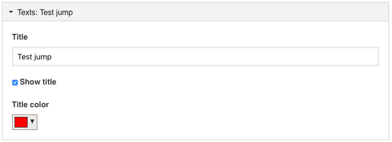
Here you can choose to have the hotspot have a name appear or not, and the colour of that text.
Hiding the title enables you to require recognition of the visuals in the hotspot area selected. Ideally use this along with a Text field to explain what you want the viewer to do.
When the user presses a hotspot, they will either be taken to another part of the video or the hotspot can be a link to take the viewer to another webpage. You may add as many hotspots as you like. The following is configurable:
- The number of hotspots
- The placement of each hotspot, and the associated popup content
- The color of the hotspot
Enter the time you want the hotspots to appear. Choose to pause the video or not.
Choose your Destination. Click Timecode and enter the time you want the video to jump to when the hotspot is clicked.
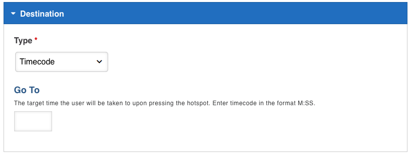
OR click Another Page and enter the URL if you want the viewer to be taken to another website when the hotspot is clicked.
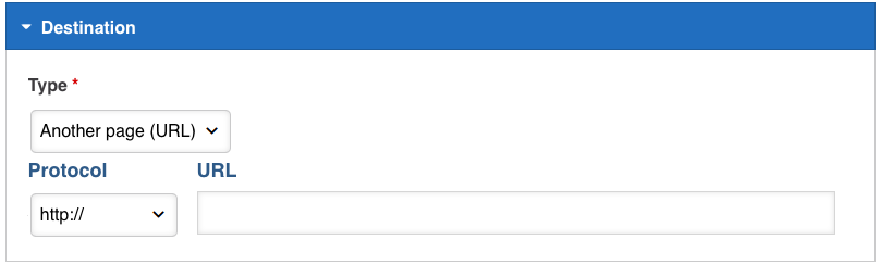
Choose your Destination. Click Timecode and enter the time you want the video to jump to when the hotspot is clicked.
OR click Another Page and enter the URL if you want the viewer to be taken to another website when the hotspot is clicked.
Here you can decide the shape of the hotspot and if it is to be transparent or have a colour.
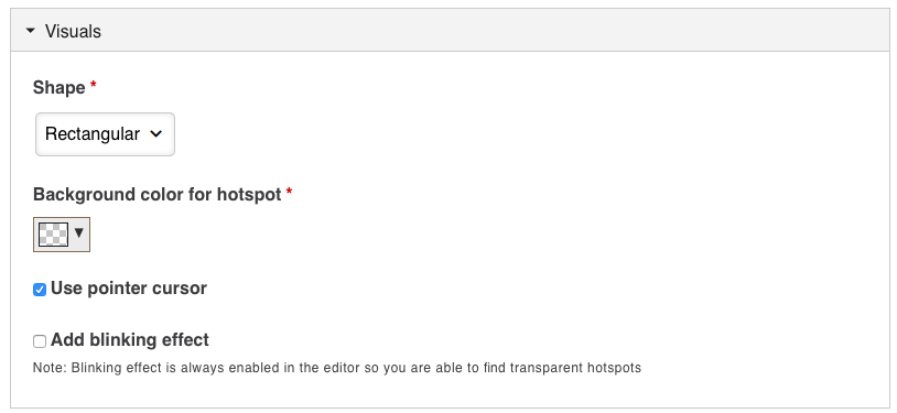
If Pointer Cursor is ticked the mouse arrow will change into a hand when the viewer is on the hotspot.
Blinking Effect will enable a transparent hotspot to be visible with the border flashing on and off. Coloured hotspots always appear solid and do not blink but the border will flash on and off.
If Pointer Cursor is ticked the mouse arrow will change into a hand when the viewer is on the hotspot.
Blinking Effect will enable a transparent hotspot to be visible with the border flashing on and off. Coloured hotspots always appear solid and do not blink but the border will flash on and off.
Here you can choose to have the hotspot have a name appear or not, and the colour of that text.
Hiding the title enables you to require recognition of the visuals in the hotspot area selected. Ideally use this along with a Text field to explain what you want the viewer to do.
Name Input
Name Input makes it required for viewers to identify themselves. Then any responses are available by named individuals in the Reports.
Named responses are ideal for assessing individual learners’ progress and for any marking or testing. Detailed data of each viewer’s responses are available separately.
If this field is not used then your EVA will return reports without you knowing who responded. Unidentified EVA’s can be used to conduct Surveys or gain general information on viewers’ responses.
If this field is not used then your EVA will return reports without you knowing who responded. Unidentified EVA’s can be used to conduct Surveys or gain general information on viewers’ responses.
Just click on the tool button, move the window to wherever you want it to appear on the screen. The name input field always appears at the very start of the video.
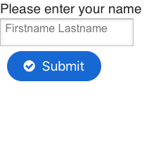
Hit SAVE and that’s it!
Hit SAVE and that’s it!
YouTube and Private Videos
eTV regularly downloads and adds YouTube videos to eTV. We can also download videos that are legally posted openly on other websites. These videos then appear in Curriculum Collections where they are permanently stored for use in eTV. If there is a YouTube (or other) video you want to use to create an EVA, and we do not have it already, just go to ON DEMAND> CURRICULUM COLLECTIONS and click the grey REQUEST VIDEO button at the top right of the page. We will then go and download this for you so that you can then use it to create an EVA.
(Please note that eTV will only download videos that are legally posted online and are not behind a subscription paywall. We will check this for you and advise if there is a problem)
(Please note that eTV will only download videos that are legally posted online and are not behind a subscription paywall. We will check this for you and advise if there is a problem)
Videos that are for use within a School or Tertiary can be uploaded into a Private Library in eTV. This is done by the Account Coordinator or Admin of each institution. If you do not know who that is, just contact us for help by clicking the TECHNICAL SUPPORT button. Videos uploaded into a Private Library can be accessed by all users in that institution by going to the ON DEMAND>LIBRARY page and clicking the grey “My School name” Library button at the top right of the page.
Once you have found the video in eTV just click the ADD TO EVA button on the programme page.
Once you have found the video in eTV just click the ADD TO EVA button on the programme page.